What should be on a landing page? What are the Best Practices with Conversion for your WordPress website? Let’s look at some example with Kori Ashton.
Video Transcript
Hey, y’all. Welcome to another WordPress Wednesday. My name is Kori Ashton at WebTegrity in San Antonio, Texas. And this is a video, one of about 200 free WordPress tutorials here in our YouTube channel. So be sure to subscribe because every Wednesday I’m creating some sort of video just like this for you to be watching and hopefully using to improve your online marketing.
This week I wanna look at what is a landing page? We keep hearing that all the time in search engine marketing, a landing page, a landing page. Does that mean just your homepage on your website? Or what makes a good landing page, right? So the simple answer to this is it’s a page that somebody lands on when they come to your website, whether they found that link inside of an email marketing piece, out on the social media post, somebody emailed it to them, or they saw it inside of Google search results or Bing search results, right? Whatever link they click on and come over to your website and see that page, that’s the page they have landed on. Now the term though is used a lot, specifically whenever you’re paying for ads. Because you want an ad to correlate with whatever content the person clicks on and comes over to and lands on that page. You want the content to correlate between the two, the ad versus the content on the landing page.
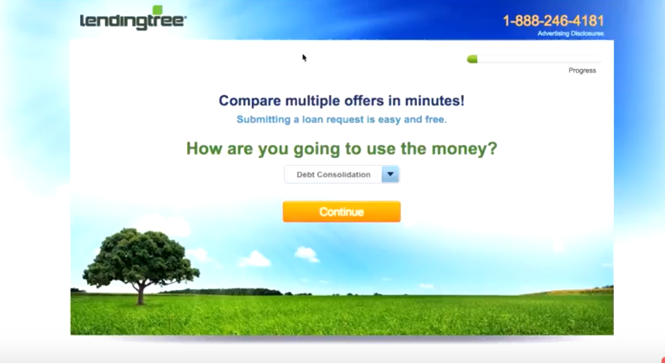
So let’s talk about what makes a great landing page. And I’m gonna give you couple of quick examples of it. So let’s say for instance I’m in Google and I’m doing a quick search for loans, and I see all of these ad options here, right? If I were to click on one that says fast personal loans, this is from Lending Tree, bad credit okay, a personal loan, if I were to click on that and open it up, this is the landing page that they offer from that ad. I mean I’m not scrolling anywhere.

Look how short this landing page is. And there’s really no upper navigation. There’s a big call-to-action phone number if I wanna dial now and call them. But really it’s drawing your eyes with this color here, this bright orange button. It’s drawing your eyes to do exactly what they’re asking you to do. So you’re supposed to choose, you know, however, you would use your loan and click continue. And then it’s gonna walk you through the process, and it shows you a progress bar, it’s gonna walk you through the process to find that solution. So this is kind of a process landing page, right, where they’re gonna click and go through a little bit of a process to get to the end result. You really wanna simplify the heck out of these landing pages.
- Make it as simple, user-friendly as possible, right? Think about your demographic.
- How large should your font be?
- How bright should your buttons be to really stand out? Don’t give them five different calls to action.
You see on this page example you’ve got two calls to action, either click that continue button or call us today, right? Really great example. Let’s give you another one with a little bit more content on the page. This is a great landing page example from Unbounce.com. I’ll put the link to that in the description box below. But as soon as you land on this you get to see, you know, a fun little picture. Maybe this was the picture that was on the ad as well so that you’re correlating content. Here’s the big call-to-action. And if this doesn’t totally convince me to just do this in the moment, they’re gonna give you other spaces where you can add in maybe some social proof which is testimonials, right? Another call-to-action. And that’s the end of it right there. Another simple, short page getting you to do what they’re asking you to do. Really cool options. Check out what it would look like too on a mobile device. I mean brilliantly simple. You can’t really go anywhere else. You’re not doing anything other than the one call-to-action. It’s either there or here, giving you the same results. Really cool options, huh y’all?
I hope this is helped you better understand landing pages. I’ll see you next week. Bye, y’all.

