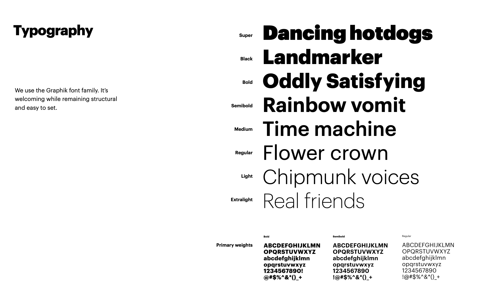
When you’re ready to elevate your brand to a more professional level – you’ll want to create a brand guide book. This can be as simple as a Peloton’s PDF or as interactive as Spotify’s web-based version.
Snapchat’s Style Guide
Snapchat has gained huge polularity over the last decade. Their ghost is seen everywhere… but they want it to be a very specific shape on a very specific shade of yellow. They lay out all the brand guide rules in their PDF brand guide.

Peloton’s Style Guide
Peloton wants to be known as an elevated brand – not just a standard exercise bike. In order to do that they set the rules around their tone, their style, their voice, and their imagery. Here’s how they make that happen in Peloton’s Style Guide.
Twitter’s Style Guide
Tweet all about it – but stay on-brand. Twitter has been in the news as of late and when you’re purposely sharing your brand or gaining exposure in a more public light -you want consistency. You get that by providing a public style guide. Here’s Twitter’s Style Guide.

Spotify’s Style Guide -shocking colors
You may not even know all the color Spotify allows you partner with its lime green logo. Take a look at their brand guide to see what’s allowed and what’s NOT.

Starbucks Style Guide
Starbucks provides a high-tech interactive web-based style guide that showcases their logos, colors, voice, typography, illustrations, and photography in a very easy-to navigate interface.
Want your own? Here’s a free style guide template:
If these brand guides inspire you – it’s time to make your own. Follow along in the outlines Hubspot provides in their free “How to Design a Brand Guide” guide. See even more examples here.
Take a free course
Hubspot even offers a free course you can take to learn step-by-step the best practices when creating. your own style guide.

