A contact page needs to be easy to understand, simple to use and still have a WOW factor to keep the enthusiasm of the visitor engaged. How do you do that? Kori Ashton shares Contact Page Examples with you.
Full Transcript
Hey all, I’m Kori Ashton. Today we’re gonna be looking at 10 different examples of contact pages, different layouts, different options that you can do, and hopefully, this will inspire you to be more creative whenever you’re building out those pages for your clients.
I don’t know about y’all, but by the time I actually get to the contact page in most of my projects, my inspiration and my creativity is just exhausted. I spent a lot of time on that home page, making it look really amazing. Maybe the about us page has really cool layouts. But seriously, by the time you work through each and every one of those pages, and you get that contact page, it’s really easy to just throw a contact form on there and a phone number and just be done with it. But I wanna challenge you that that is probably one of the major calls to action on most your clients’ websites, or on the website that you’re trying to build.
People are gonna click on that contact page, and they still need to have that trust factor there. They still need to have that inspiration there where they still want to click and fill out the form, they wanna call, they’re really excited to work with this company. So how do you keep that type of inspiration? I’m gonna show you some designs right now that will hopefully keep your creative juices running, as you hit that contact page.
Wow Factor Contact Page
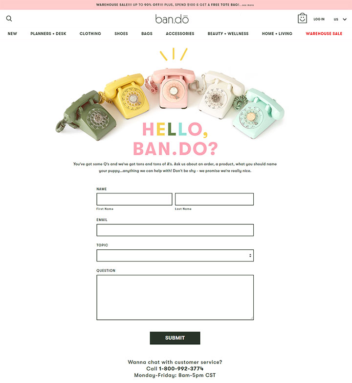
We’re gonna start super simple first, and this one’s as clean as they come. I like it though because it still’s a little bit of a wow factor with this fun little GIF that’s animated up here, showin’ me just a little bit of sparkle, gives it a little bit of life on the page, makes my heart really happy.
Clean and simple form, that’s it, there’s an 800 number with the hours of operation, and of course, they have their simple footer. Really clean, really basic.
Large Boxes Contact Page
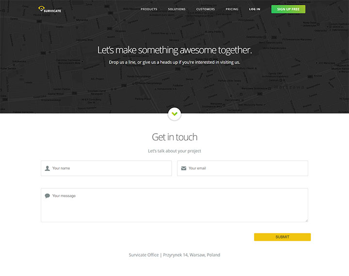
Another example of just clean simple conversation is this. I just like how large the boxes are. I do like the icons living inside this form to kind of help give some visual guidance. And then again, submit. These are your options, you know, get in with us, that’s it. That’s how we want you to connect with us, submit right there. Anything else is gonna be further down, and you can sign up, sign up for free, that’s that.
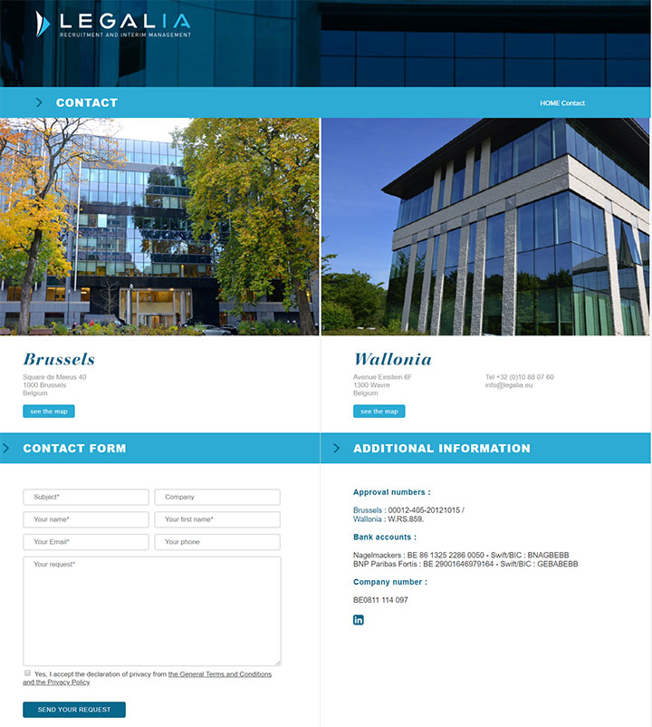
Contact Page With Location Pictures
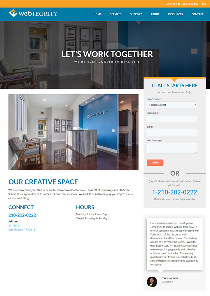
I might be a little biased, but I also think that WebTegrity, ourselves, have a pretty great contact page. We have pictures of our location to kinda show what’s it gonna be like to work with us. You’ve got your form over here on the right, that allows you some options that you can select the topic, fill out the form, or you can give us a phone call if you like.
Our creative space, a little bit of direction here on how to get to us. Our hours of operation. A review even, which I think is pretty great, because you allow other people to read their experience of working with us. If you wanted to, you could even add in a Google Map, living right here. And there’s your simple footer. So really easy.
This is kind of a one third, two-thirds type of layout. Here, just to show you a different example, and it doesn’t always have to be 50/50 down the page in two columns, like this example.
Contact Page With 2 Locations
Now in this example, these people have two locations, so it just makes sense that they would have kind of a 50/50 split screen here. Walking down the page you’ve now got your form and your phone numbers allowing people easy access.
Different Locations Contact Page
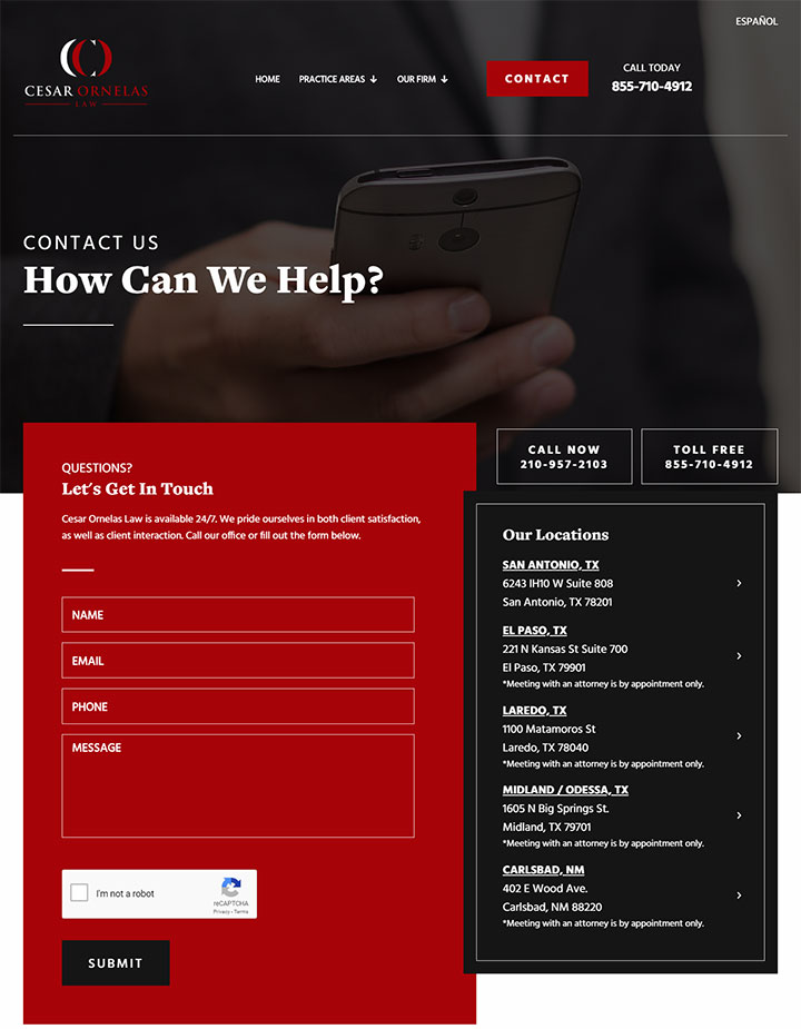
So different locations can be tricky on one single contact page, but I’ll give you another example here, of where they’ve got a main phone number, but if you click on their contact page, you’ll come here and start to see the different locations, again with one simple email form here, with a captcha on it, submit.
Simple, easy, straight forward, nice clean layout, still building confidence, still building trust.
Different Departments Contact Page
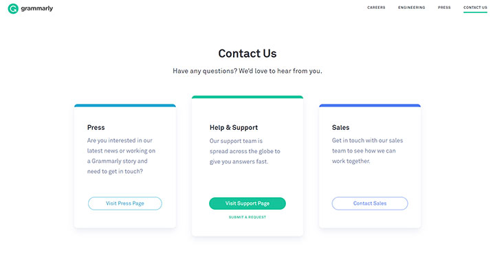
So other things that get complicated, is when you have different departments to deal with. How do you separate those out? How do you give examples of how people can get to the right team member? So this is one of those ways you can do it.
You can break it into different categories of who they are trying to connect with, and then maybe have that one major 800 number or something like that that they can connect with you on. Something like this again, depending upon, who things need to go to, you might have to have different addresses, different email addresses.
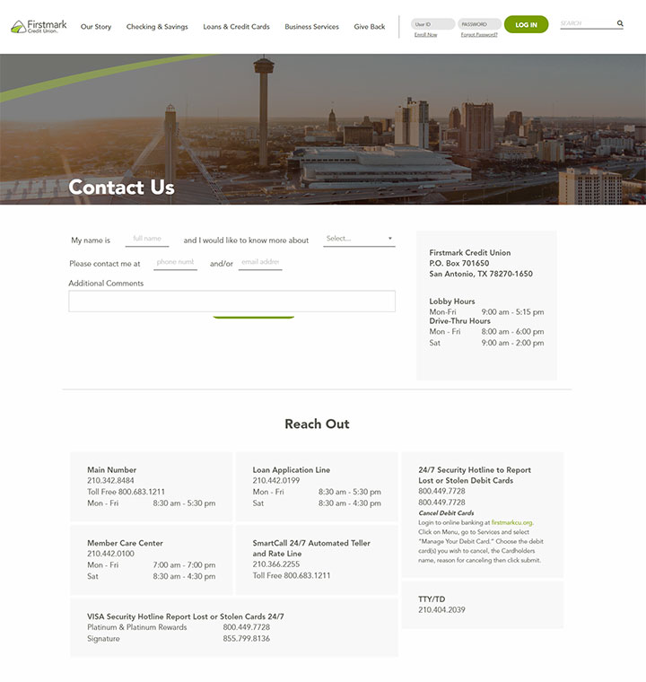
Multiple Locations Contact Page
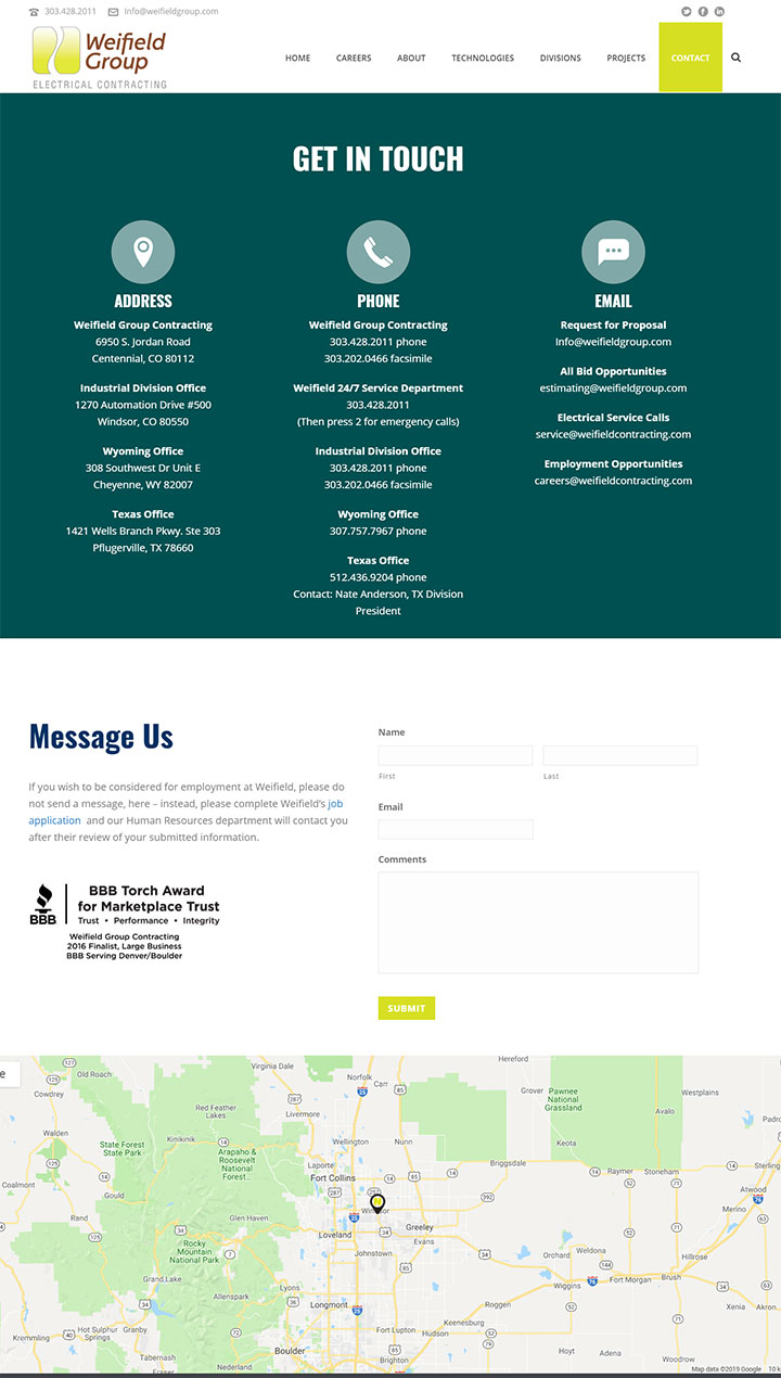
I’ll give you another example of a cool way of doing this, in a few more as well. But this one has addresses, phone, email, and then if you don’t want that option, you can scroll down and it says message us. You can fill out the form. It mentions their BBB reputation, which I think is great, building that trust factor again. And they also have a Google Map. I like this idea.
Friendly Contact Page
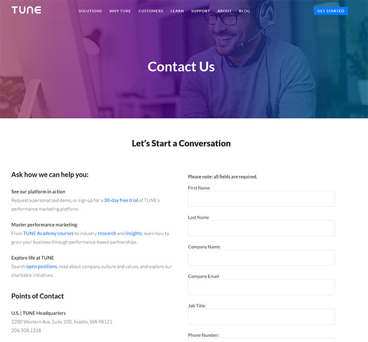
This is another one, where again, you’ve got a happy person, with a headset on, showing that we’re gonna connect with you, it’s gonna be a great experience to talk with us. Let’s start a conversation, this is very casual, non-committal language, which is good, so people don’t get form fear and feel like they’re locked to working with you.
Having a conversation like how can we help, is great. So you’ve got different links on here, different opportunities if you need more content on a page. If you’ve got a more complex type of client or project that you’re building out. You’ve got a 50/50 split down the screen, and you also have their different locations. So I think this is a really great idea if you have a lot of complexity to happen on one page.
Fun Contact Page
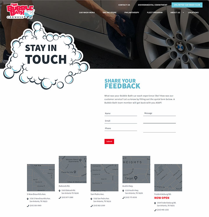
This one’s fun. This is more of feedback, stay in touch, type of contact page. Share your feedback. They can come here and just fill out the form really quickly, and then we also have the different locations that you can click on and a little model pops up giving you a quick glimpse of pictures, hours of operation, and address and phone number to these locations. So really easy, nice clean layout, fun, and different too, so I think that’s something I like about this design.
Corporate Style Contact Page
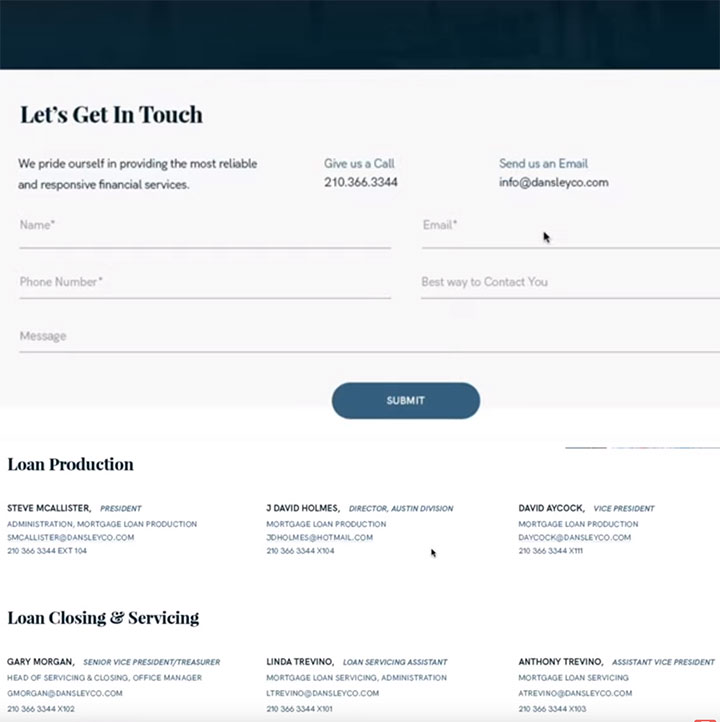
Now, this is a very very clean kind of corporate style. You’ve got very clean lines here, very easy to understand, let’s get in touch. They’re gonna fill out the information here, click submit.
And then here’s the other example I wanted to show you, when it comes to looking for different staff members. So if there are multiple people, depending upon what department, or who needs to be connected with, this is another really clean way to layout those individuals and their contact information.
Edgy Contact Page
And lastly, and probably the most edgy that I’ve found that gets me super excited and really inspired to share this with you, is this design that our team did, my name is, and you would enter your full name, and I would like to know more about, or need help with, and you would use this drop-down option here, to have those options. Please contact me at, you would enter your phone number or email address and then add more comments and click submit.
This is somethin’ really fun that we’re seeing more and more people participate in, especially if you have a younger demographic as your audience. You all have the contact information there on the right. If this seems too confusing, they can contact you here, and the hours of operation.
Reach out, you’ve got other options here, again this is more complex whenever you have different departments or different types of services you provide. And then you can also find a branch near me, and click visit us. So really really clean contact page, getting them to just do exactly what you’re asking them to do, just fill out a form and connect with us.
Well, I hope that allows you to keep those creative juices flowing, and maybe you’ll go back and revisit some of you designs you’ve already done. Maybe it’s an upsell opportunity. Call up your clients, say hey, I’ve got a much better idea for that contact page. What if I charge you 300 bucks and completely redesign it? You’re gonna love the new look. This could be an opportunity for ya. I hope y’all are havin’ a great one. I’ll see y’all next WordPress Wednesday. Bye everyone.