Here’s another great list of 10 examples of About Us Page Layouts to inspire you to have a great looking WordPress website.
Hi everyone, my name is Kori Ashton, and it is another WordPress Wednesday brought to you by Liquid Web, the absolute best in hosting. I’m gonna tell you right now, for those of you who struggle to build out your theme, and build out your websites, and you find a lot of speed bumps along the way, one of the best safety nets you can ever have, is having an amazing hosting company that understands WordPress, that you can call up, or you can go online, chat with them, talk to them, and get help specifically for the world of WordPress, and that is Liquid Web. I highly recommend checking them out. I’m gonna give you a coupon code, so you can even save money.
All right, let’s get to the tutorial. Those of you who are interested in my health journey, as I am surviving cervical cancer, stick around at the end. I’ll share a little bit of that with you, but for now, let’s talk about great examples of About Us pages, and how you can be inspired to really make an About Us page be dynamic, creative, get some different ideas of what can be on a page, because this is one of the pages that a lot of your clients, and including yourself may struggle with.
If you’re like most of us, you’ll find time and time again that your clients are gonna struggle with writing their services information, and always writing their About Us information. It’s as though when we get to talking about ourselves, we struggle. We don’t really know what to say. We don’t know if it should be in first person, or third person, or what we should include in that history on that page. It can be very difficult when you get to that page. So, let me show you some examples, give you some ideas, get the juices flowing for creativity, so that you can maybe think about ways that you can fill in blank areas or expand out the story of your client or the project that you’re building, specifically, on their About Us page. Let me show you some cool examples right now.
Yellow Leaf Hammock About Us Example
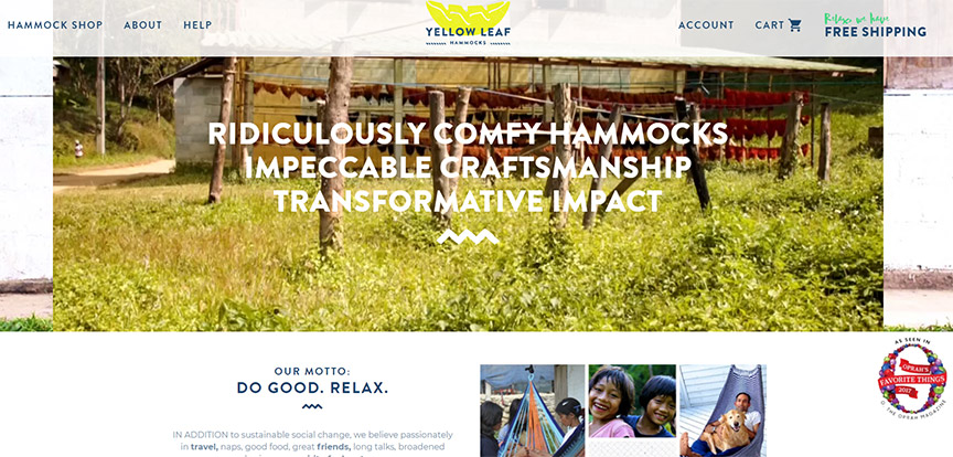
It is pretty straightforward, whenever you have a lot of content, to be able to create a pretty dynamic About Us page, especially if your client or your project that you’re able to work on, has some sort of video asset. Even if it has no audio to it, just to have something really dynamic sitting here on this About Us page. This is Yellow Leaf Hammock. Just shows the story, really adds a wow factor to the page, brings the whole page to life, but it opens up with their motto, Do Good, Relax. Has beautiful images of happy people.
Of course, we always want to connect with happy people. We want images to be able to help tell the story as well. Icons are another really great feature to have on a page. It allows the story to be shared a little bit more easily and quickly, visually, doesn’t require people to read a whole lot. But what I’m gonna show you with this page, is there’s really not a whole lot of text information.
What they’ve done is they’ve laid out some images really well down the page that allow it to elongate, or be a little bit more of a narrative. So, think about that, when you’re thinking about, man, they’ve only got a very short paragraph of About Us information. You can still make a pretty dynamic About Us page. You can add in maybe their latest news to the About Us page that allows us to catch up with what’s going on inside the company.
You can talk about any sort of programs that they might offer, or different opportunities that they might offer. You might talk about their process, so this is talking about their craftsmanship, the connection that they have to the different communities that they give back to, and how you can be a part of it. All of these things really play to a very dynamic, very engaging About Us page. Then again, these icons just for how you can get involved in, you can share the love, you can sign up and you can shop now.
Uber About Us Layout Example
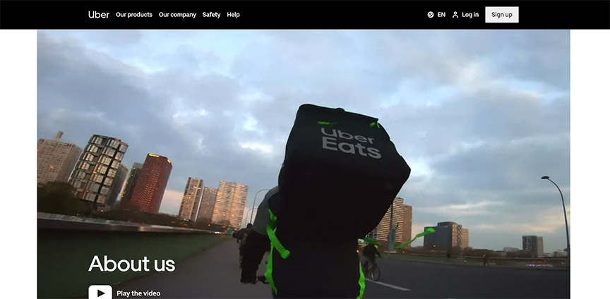
I’ve used the Uber website several times for other examples, and their About Us page. It is just as dynamic.
They have a really great video here for you to be able to watch just without having to click play. It’s already running, there’s no audio to it, but if you wanted the audio, they give you that option. You click here, play the video, and open it up, and actually hear the video, hear the story behind it.
Nice large type typography, there’s a letter from the CEO, which I think is very important to have, if you have that type of brand, where you’re very communicative with your audience, you want to present your CEO in the forefront, share your story that way. This is again, really simple dynamic layouts, side by side, 50-50 split, very clean, very easy to read, not a whole lot of text, and you can really make a very dynamic page all the way down line.
You have some company info here, split 50-50, Who’s an Uber driver, sharing about the community, who they hire, or what their community looks like, and then talking about diversity in the community, keeping up with the latest.
Now again, they bring back in that news or their blog, Investor relations, different things like that. You literally have to be creative, and think about what sort of content can actually grow on this page, and what are people looking for, when they’re coming to the About Us section, right?
Refinery29 About Us Page Layout
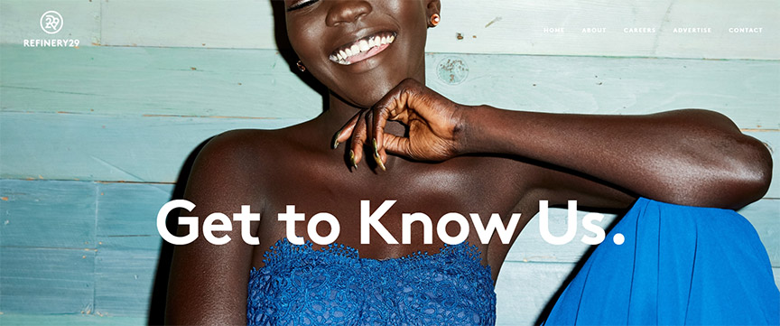
Here’s a pretty cool example of no videos. So, some of your clients might not have that type of really cool dynamic asset, so how do you then create that same excitement, and that same engagement.
This is Refinery29, Get to Know Us, beautiful smile on the screen, Get to Know Us, nice large typography. Now this is gonna be more of a very simplistic, very minimalist approach, easy to read. Hello: Who Are We, read down the list, a little bit of their backstory, of how they got started.
Then they break out Our mission, Our essence, Our promise, Our vibe. I think these are really cool ways to lay this on the page, where it’s not swallowed up by the other paragraph above here, but they break out this whole section here, and just give you in chunks. Love it, Making Headlines.
Again, they’re bringing in their latest news with this four-block, column layout, love it. Then a call to action, of getting connected with us. So, they have more opportunities here. They’re different locations listed on their About Us page.
Born In Brooklyn About Us Page
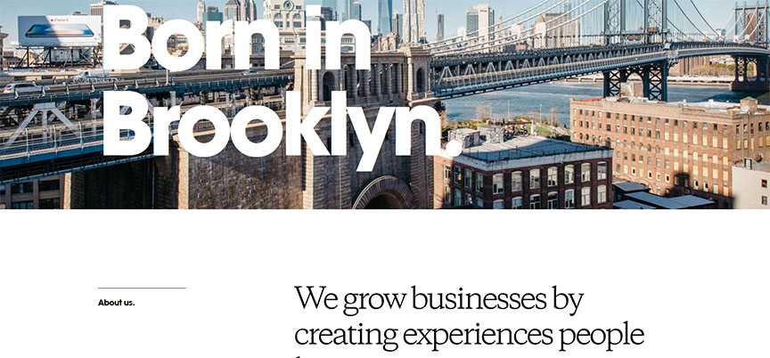
This is a cool again, minimalist approach. Born in Brooklyn, very large typography, a little bit of text can go a long way. Again, as you see these sections broken out in this full width, dynamic layout. You’re gonna see their strategy, their product, their marketing, and all of these would be able to be clicked on and read more.
So, this is if you have a lot of content, you want to break it down into chunks. Made with love, a culture of innovation. Again, allowing this typography to just break out the sections, and really engage your eyes, allow your eyes to rest, even though there’s a lot of content going on. Cool graphic always helps. I was here before it was cool, and then they show their different locations, and how to get ahold of those different locations here with an email address. So, very cool opportunities, very simple. Again, very simple content down the page.
Ugmonk About Us Example Layout
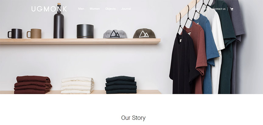
Ugmonk, if you’re an avid watcher of my channel, you know I love this brand, and their minimalist approach to design. Again, this is that narrow, in the center layout, Our Story, very minimalist approach, beautiful large images, allow the stories just continue down the page.
You don’t really have to worry about a lot of content, as long as you keep things clean, if it’s minimal, right?
Outbrain About Us Example
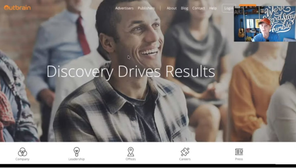
This again is another example of a really great smiling face. You have some diversity in the image as well. You want to think about your demographics, and who you’re speaking to. So, if you have a large image like this, you want it to be able to load quickly on that About Us page.
Bring in some text, so that we know we’ve landed on the About Us page. Discovery drives results, and then you have the icons again, allowing you to just click quickly to the different sections if you’re interested in them. Here’s the company overview, our leadership, our offices, careers, press, or that news section that we were talking about. T
his nice full-width breakout section, with a little bit of a pop of color on the page, allows your eyes to rest, easily reading that text and giving us these dynamic sections. Now this one is just a click and play video further down the page, allowing almost that full-width experience. Then they also do something that I highly recommend as well.
We’re seeing a lot of people enjoy these kinds of statistics on a page, allowing your eyes to rest, but really bring out some pop of information very quickly. So, think about that. If your clients might have three quick statistics that you can put chunks out on the page, you can do that easily and quickly. Also showing something of your vast range of your global reach, right? Thinking about how far does this client’s reach really extend across their state, their city, their country, the world? What does that look like, and how can we showcase that maybe with a map, showing their extent of their reach and their credibility.
All this plays to it. So, engaging something like this visually on their About Us page really adds legitimacy very quickly. 18 Global offices, 55 countries, 600 plus employees. That immediately brings that legitimacy into place.
Mailchimp About Us
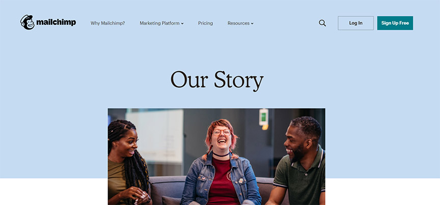
Mailchimp is a brand that I’m very familiar with. I use them consistently, y’all probably have used them. Their About Us page is pretty fun. I love it, it says Our Story, and you’ve got happy people again right away. I mean, you can almost hear the laughter in this picture, right? Makes you excited, makes me want to read down the page and see why they’re laughing.
Here’s the founder story, just shares a little bit of their back stories and images, again, to help tell that story of Ben and Dan, and then talks more about their culture, which I really enjoy. You’ll notice here there are some links off the page, if you want to learn more about their leadership, as you’re reading down, you want to learn how to join the team, you can click here and come apply, see what jobs are available. But, I love the fact that they bring in their culture, and they start to talk right away about what their vibe is, and what you can expect in not only working with them but working for them. Corporate citizenship, this is talking about how they give back to the community.
So, I love stuff like this, and then there’s more opportunity here to learn more about Mailchimp in their news section, talking more about their platforms, talking more about their reviews. So, think about that. Again, there are different ways to bring in your culture, bring in your news, bring in your job applications, if there are any open positions in your group. You can list all that kind of information on an About Us page.
WebTegrity About Us Layout Page
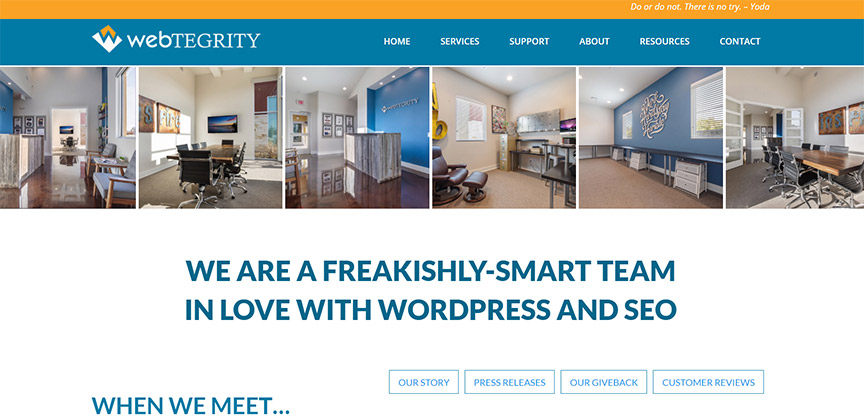
Again, I be a little biased, but I think WebTegrity has a pretty kick-ass About Us page. You get to see some images of our office, shows you what it’s gonna look like to come in and work with us, shows you our creativity. We have a little bit of a cheeky slogan here. It says, We are a freakishly-smart team in love with WordPress and SEO, and then it says when we meet, you’ll understand WebTegrity difference.
You’ve got a couple of buttons if you want to learn more about our other areas of our company, but right away, we’re gonna show you our team, because that’s who we are. We are a team, we are a team effort. Every single one of our team members pedal really hard and work really hard to make great websites for our clients, and we all work really hard together, as a community, as a family. So, you’re gonna see the different team members down this page, you’re gonna read a little bit of their bios, you’re gonna be able to click and read a little bit more about them if you’re interested in any one individual.
You’re gonna see some social media icons, their WordPress profile, their email address that you can get ahold of them if you need to, and of course, we’re gonna have our office dog, because Lana is amazing. Hospitality concierge, and then you’re gonna see a little bit of our attitude as well, our culture, as we dynamically bring in our Instagram feed.
So, think about this, when you’re trying to fill out a page. You can bring in some of their social media feeds if you’d like to, and have that culture, that vibe, those announcements, that conversation listed here on the website. I think it plays really well to our culture, and lets you see a behind the scenes of who we are.
Humaan About Us Page
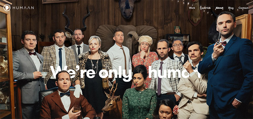
Humaan is another really amazing brand, that if you follow them, you know that they really are a little bit more cutting edge. They do things a little bit more cheeky as well, a little bit more fun, and I wanted to show you their there About Us page because I think this just gives you a really more of a playful example. I’ve been a little bit more corporate, a little bit more minimalist right now.
So, let’s look and see, if you have a large team, what would it look like to lay that out down a page. Very, very simple text here, engaging the conversation. They have really fun images, that have this movement to them, that just bring life down the page, allowing you to hover over, learn a little bit more about that person, and then see some social media links as well.
So, this is a larger team, but still, it’s fun, playful, allows you to have that bio information, but you’re able to scroll down the page, take it all in, see who’s what, who has what role. Then it talks a little bit more about what we do, what we don’t, right? What we don’t do. I love that, just again, conveying their culture, their mindset, their vibe, shows you a little bit of a picture of what it looks like in their office space.
Again, shows you their culture, and their creativity and their sense of humor shows you some of their work, shows you some of their educating moments, sharing and teaching in the community. I love stuff like that, and then hear those stats that we start to see, that we really can digest very quickly and easily, and fall in love with.
So think about something like this. There was not a whole lot of text on this page. So, if your client says listen, I don’t even know what to write. This was four or five sentences, that’s it, and there’s this really dynamic, cool example of what you can do on an About Us page.
Coneflower Creamery About Page
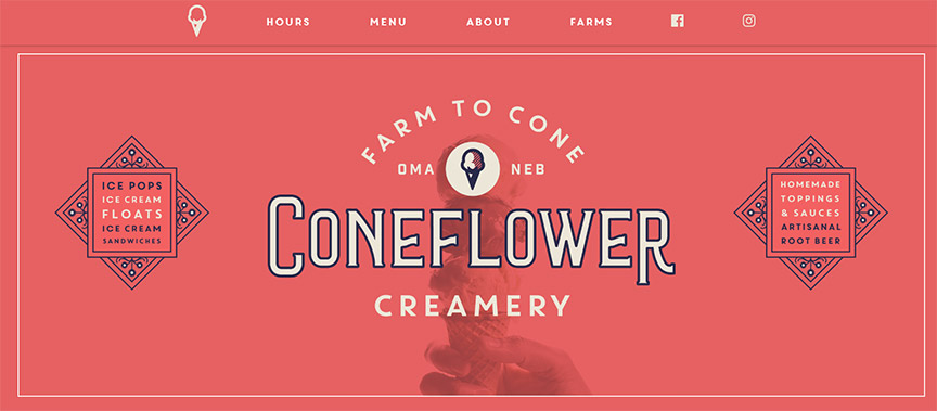
Okay, so let’s say your client really is just very, very minimal, has five, six sentences, doesn’t have anything dynamic like that, doesn’t have a large team, is almost a solo entrepreneur, or maybe a two-man band, who knows. Something like this is very clean and simple. You can just add to it with a little bit of ornate imagery, maybe you don’t have big square images, maybe you do these little circle headshots, like these profile headshots.
So, this just starts out with a little bit of a chef, a garden, and a dream, a little bit of their backstory here, a little bit of why to choose them, and then their founders, the chef, and the artisan. So, a little bit of bio on that. Again, you don’t have to have super long pages. This is one of those simple one-page websites so that when you click on About, you scroll down the page, that’s where you get to this very simple, blocked out information. Here’s another example. I think timelines are pretty cool options that you can put inside of About Us information, so I’m gonna show you two different options for timelines, that you can do our history here. This has the date in the middle, and then a side by side viewing, as you scroll down, and gives you the history of the company.
Freshworks About Page
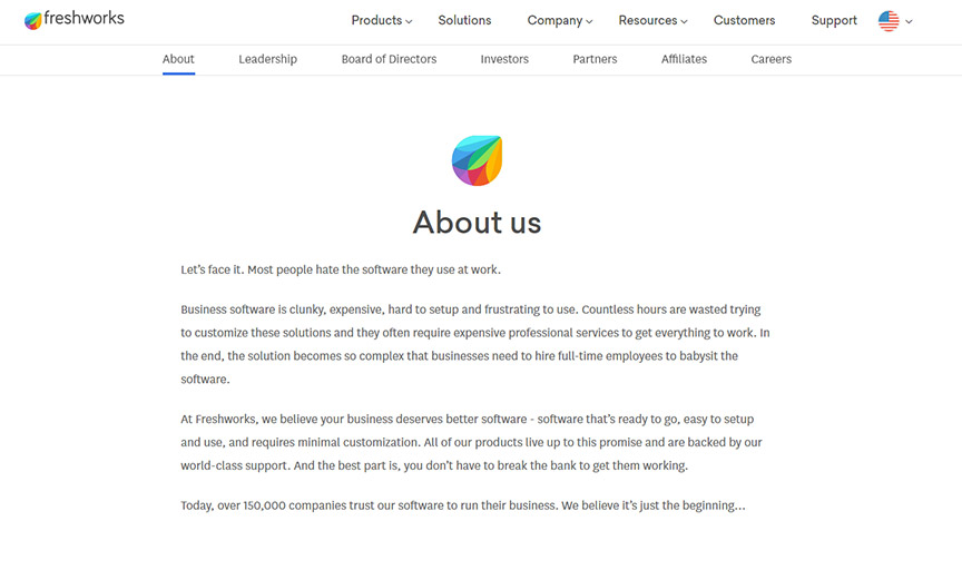
This is freshworks.com, on their About Us section. So if you scroll down, you get to see their timeline, their history. I think this is really cool, especially if you’ve got somebody that has a lot of history, been in the business for decades, maybe even a few hundred years, you can really show that backstory.
Quip About Us Example
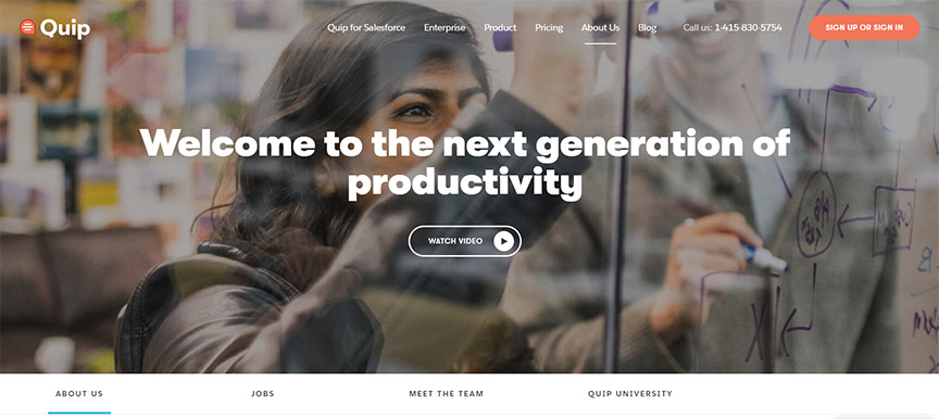
There’s another example here that I can show you, where you have this very fine line that kind of plays down the page and allows your eyes to flow from paragraph to paragraph. But then we really get into some of those statistics, and then here’s another fun timeline that you can play around with, and hover, and have that engagement.
So think about doing something like this for your client to just add to that wow factor, and keep people actually involved and engaged.
One of the easiest things you can do, is if you follow my channel, you know I’m a total Divi fan. D-I-V-I is the theme that I built, askkori.com on, and I highly recommend. They have a lot of pre-built, out of the box, easy to fill in the blank, About Us templates, or they call layouts, that you can one-click, build out these layouts down the page, and then all you do is go in here, click this section and fill in the blank, and type in your information.
They’ve already got these breakout sessions where you can put a quote from your CEO, or your founder. You can add and change quickly these icons really easily, bring in your latest blog, your news sections, all of this is easily done without a lot of code, or any code for that matter, inside the drag and drop environment of the Divi theme.
Conclusion
So, I know that was a lot of different ideas, a lot of different concepts that you can play with, but what I want you to do is just get creative. It can be a struggle, especially when your client says to you, I don’t even know what to write. Think about this minimalist approach that I’ve shown you.
You really don’t have to have a whole lot of About Us information to make that page more engaging. Think about imagery, think about video, think about a timeline, something like that to just add a little bit more of a wow factor, so that you’re engaging that consumer as they’re coming through, and really trying to figure out the history, the backstory.
Tell that story of your client, allowing them to feel a connection there, allowing them to want to engage with that brand. That’s what an About Us page is all about. I hope this has helped you guys. I’m enjoying this series. Last week I did Contact Us page examples. If you didn’t catch that, I’ll put that link in the description box below this week’s About Us, and we’ll talk more about maybe some service ideas, maybe other ideas when it comes to how to build out any sort of internal bio page.
Let’s get some ideas together, and really get creative with what we can be doing, to make your websites a lot more dynamic than where you’ve landed now. Let’s grow and let’s evolve those, so that you feel that growth as a freelancer. If you’re interested in my health journey, I’ll give you an update in just a minute. If not, I’ll see y’all next WordPress Wednesday. Bye everyone.
My Health Update
Hey y’all, so I’ve lost my glasses. I can’t find them anywhere, so that’s probably one of the reasons why I look a little off this week, but I’m also dealing with cervical cancer. Those of you that follow my channel, you know that on July 1st of this year, 2019, I was diagnosed with cervical cancer, and I have been going through chemo and radiation treatments now for the month of July, and starting now into August, I am experiencing some of the side effects that you would think about with radiation and chemo, which is a lot of fatigue, and doing my best to just keep up my energy.
One of the things that I look forward to every week though, is getting on camera with you, and sharing with you, and still challenging you, to grow your company, grow your brand. I look forward to it every single week, and all of your amazing tweets to me, and your direct messages, and your comments on the videos, and your emails in my inbox are so encouraging. Thank you so much. The outpour of love literally from around the world, has just been phenomenal for me. I’m feeling a little stronger this week. I’m looking at potentially doing some internal radiation, as the tumor is not truly responding yet to my radiation treatments, so we might go a little bit more aggressively, but we will see. So, again, I thank you for your prayers, thank you for your love and support through all of this, and I know that the season is is just a season. So, I know that I can get through this.
I do have a fun announcement to share, that I have been accepted to speak at WordCamp U.S. this year, in St. Louis. So, November of 2019, if you’re planning on attending WordCamp U.S., I plan on being there, prayerfully, as long as I feel healthy, I will be able to be there and I will share some of my story with you, as I get to share in a workshop this year. So, I’m really honored that they’ve accepted my suggestion for WorkShop, and I look forward to enjoying that, and hopefully meeting a lot of you there.
So, all right y’all, have a wonderful week. Again, thanks for all the encouragement, all the love. I couldn’t do it without y’all. So, I hope y’all are having a great week. See you next time, bye everyone.