How do you make your fonts responsive on your WordPress website? Kori gives you a few resources to make that step simple.
Video Transcript
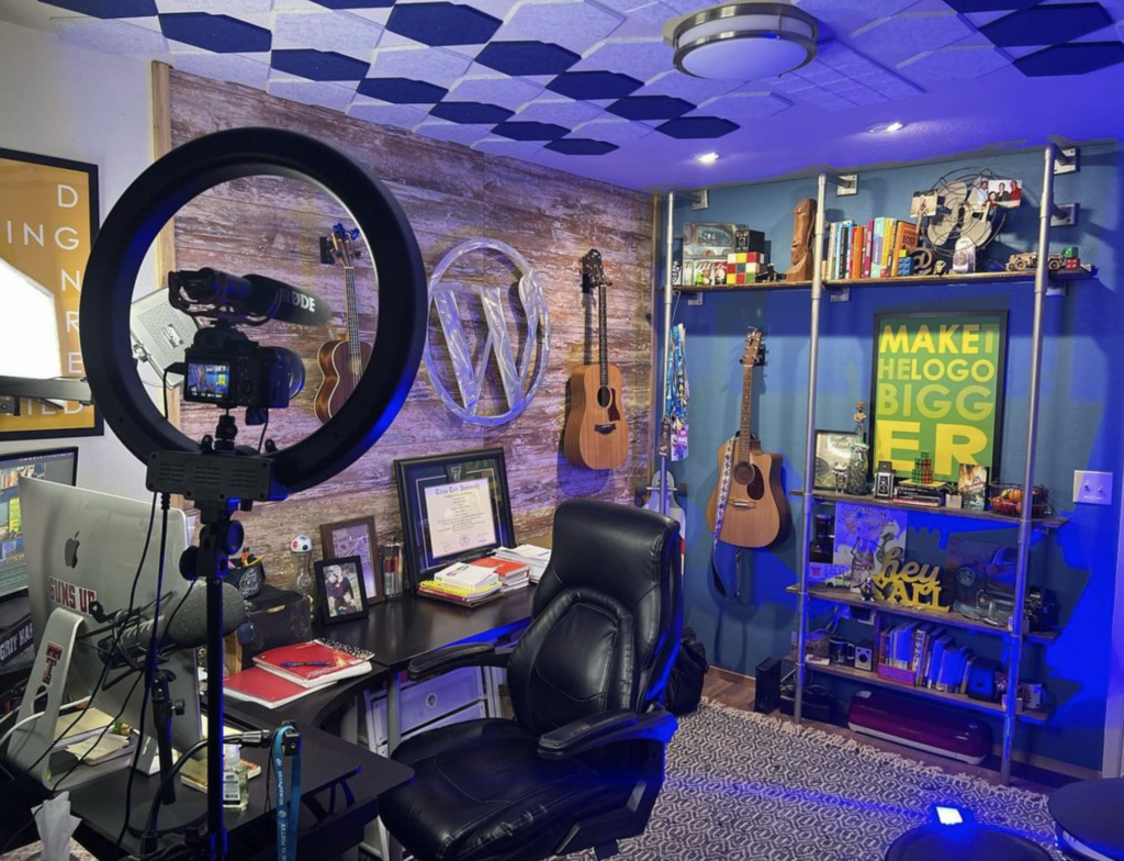
Hey y’all! Welcome to another WordPress Wednesday. My name is Kori Ashton and as you can see, I’m still trying to move into this brand new office. My goodness y’all. But, that is not going to keep me from doing another video this week for you so that we could talk ‘nerdy stuff.’
How do we make fonts on our website really slick and responsive looking so that maybe if we want to use a nice larger font on a desktop that’s a nice big screen, how is that going to look though on a nice small screen (on a cell phone maybe?) Let’s talk about how we can do that.
You’ve got all sorts of different options. Let’s say this font is just way too big so that whenever I shrink down my screen, I just don’t like at all the way that looks. I want it to be responsive typography. Ultimately what you want is you want your theme author (whoever coded this theme) to allow that to happen. Some of the higher-end premium themes that you’re buying out there do allow you to have nice responsive fonts. So, be sure to look for that in kind of their selling points as you’re selecting a theme.
If you already have a theme out there and you’re just wondering, “How do I get it done?” There are all sorts of answers out there. There’s a really great tutorial here (I can put the link to this in the description box below.)
This is talking about how to use Em vs. Rem instead of the extension px for pixels and basically it just talks about these being (in a sense) a responsive type of extension so that it can even-flow with your screen size. It also kind of plays on the hierarchy of things above it. That’s talking way “nerdy-nerdy”so let’s back it up and try to simplify it a little bit.
Really, you don’t have to use different extensions if you don’t want to. You can use pixels but if you’re going to use just plain out 16px (for 16 pixels) then what you want to do is be sure to use media queries. I have another video that explains fully the basic beginner level of what media queries are (I’ll put that link right here so you can go check this out.)
Truthfully, what you need to be doing is using this for any of your different devices. You would basically go inside of your stylesheet. Here where we have the top main menu item (the links in the top main menu) are size font 16. Maybe on a tablet size that is 960px wide (the max-width,) maybe we want them to just be 14. In order to do that and allow our fonts to restructure themselves depending upon the device or size of the screen; you can use media queries. This is something that you would place inside of your custom css box. You’d go in here (or maybe your child theme) you’d go into that CSS file and you would add in these @media queries. Basically you would do one for every different break or different width that you would want the fonts to restructure or resize. You can see as this goes down. That at 989 we want it to be 14 when it’s smaller at 480 max-width 767 we want it to be 12px and you can do that all the way down. Let’s say a mobile device in landscape mode 11pixels. These are probably best practices as well of what you could be setting your pixel size to.
I hope that helps you just really briefly understand that when you are seeing your fonts (whether it’s your paragraph fonts or your headers-whatever you’re trying to adjust) you can do it. It just takes a little bit of “nerd code” and using media queries to make it happen.
I’m also going to put a link to this pretty great tutorial that I found about “What are Media Queries?” (I’ll put this link in the description box below.)
Here’s that video (let me press play here and see if it’ll refresh.) This video here is one that I did on “Media queries in CSS.” Super basic. Easy to understand. I could put that link again right here for you so that you can go watch media queries and see specifically how to make your fonts responsive inside of your WordPress website.
I hope that helps you!
If you love this and you love “nerding out” on WordPress stuff be sure to click the ‘subscribe’ button over here because I want to see you next week. All right.
Have a good one. Bye, y’all!

