When thinking about the best possible design tips for Mobile-First user experience in a WordPress website it can be difficult to adjust the layout and spacing of your content. Well – the Divi Builder makes it easy! Check out these mobile-first design tips for the Divi Builder’s mobile options.
Full Transcript
Hey y’all, my name is Kori Ashton and welcome to another WordPress Wednesday.
Brought To You By Liquid Web
Hey y’all this content is brought to you by Liquid Web the most helpful humans in hosting. If you need help with your WordPress website, if you need support, if you need fast hosting, secure hosting, especially if you’re running WooCommerce on your WordPress website. I want you to take a look at them, talk to their team, talk to their support because they are by far the most helpful humans in hosting.
Mobile-First Design Tips
Hey, so everybody’s thinking about mobile-first design. As you’ve been designing this website on a desktop view, what does it look like on a two to three inch screen?
How do you ensure that your users coming into that mobile experience, have a great experience, that they’re able to click on things easily, that they’re able to see things stacked beautifully and things aren’t overlapped or shrunk in together, right?
Divi Theme/Divi Builder For Mobile-First Design
You wanna have a great mobile experience and, if your theme author has not allowed you to do that easily or quickly you’re gonna have to write a mobile media query. That means nerd code. You’ve gotta figure that out. Well, I’m telling you right now it’s one of the reasons why I absolutely love the Divi Theme or the Divi Builder.
You can download this, install it into your WordPress theme and you’re off and running, and I’m going to show you right now how to use it and optimize your WordPress website for a great mobile-first experience.
How To Create The Best Mobile Experience
So one of the most frustrating things is whenever you’re looking at your website in the desktop mode, it looks really, really great, but whenever you go to view it in a mobile phone or mobile device, unfortunately, it has some overlap, or maybe things just don’t really look that well put together.
So what I wanna show you is how cool this is with Divi that it allows you to take a quick look at what it would look like in a mobile view. So you’ll come up here and you’ll enable the visual builder. And now you can do this of course using the Divi theme, or just even using the Divi Builder on your own theme, right, doesn’t matter. Either way, the builder’s what gives you this capability.
Notice what I did down here down at the bottom since you’ve enabled the builder to happen on your page now, especially if you built it with a builder. You’ve got the purple dots down here at the bottom, we’re going to open that up and over here on the left side, it gives us different views of different devices, here’s desktop, here’s tablet, and here’s phone.
So if I wanted to test how this would look, this layout would look in a mobile phone view for mobile-first design, this is exactly what you’d want to do. And you wanna see how everything just kinda sits and stacks perfectly making certain that everything just breathes really well, that the font looks good, there’s no overlapping and nothing kind of covered up.
Well, I actually do have a little bit of a problem because down here toward this section, you can see we’ve kinda got an overlap happening here. You see how my button is hidden.
How To Correct Design Issues
So here’s what you get to do on a mobile view now. I’m gonna click on my gear icon. I’m gonna go into the design mode ’cause I need to get to this spacing area. And I want to adjust the bottom margin to give it some room to breathe on the bottom of this button. But I only wanna do this in mobile view.
So you notice here that it’s got desktop mode. Oops, let me get back there, here you go, desktop mode, right. We’ve got tablet mode where it drills down into a tablet view. And we’ve got phone mode where it drills down into the phone.
We notice also that it had the same issue on this tablet mode.
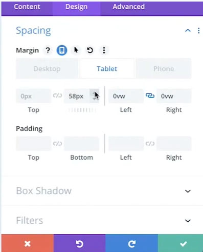
So if you’d like what you can do at this point being on tablet mode is you can go ahead and just let’s add in about 60 pixels if we want, let’s drill this out, give it some room to breathe and add in about 60 pixels in there. That looks great in tablet mode.
Let’s go look at phone now. It’s going to apply that into that phone mode as well giving me a little bit more space and when I go back to desktop mode, notice it’s not there there’s nothing there in desktop mode and it still looks really nice. So now I know that my spacing looks nice and clean and there’s no overlapping issues on any of those views. How cool is that?
You can do that also with text. I noticed down here that this text, my H3 here, is kinda just got too crowded right here in this space. So I can go in here, notice it’s an H3, I see that right here, I’m gonna go into my design mode, go into heading text and go over to my H3 section.
And then I’m gonna go to my text size and I’m in my phone view here, see this, we’ve got a desktop, tablet and phone. In the phone view, I’m gonna go ahead and increase my font size just a little bit to take join down to that second line. And then what I wanna do is come down here to my line heights and play around a little bit with that and let that breathe as well. So that looks beautiful now in my phone view.
Let’s check it out in tablet mode. I like it. Desktop mode, of course, it’s in a column over here on this right side. So you get to see that sitting nicely. How perfect is that you guys? How good does that look now? I love that view in mobile. Designing like this you can even have a better mobile experience than a desktop experience if you really wanted to.
You can just get really creative with what you do in mobile view. And I tell you what, I don’t know too many themes that let you do something like that. The second thing is what if I would like to hide something in my mobile view. Maybe I don’t want four testimonials to kind of elongate this page in mobile view, I only want two. You can do that with the Divi Builder.
Normally you’d have to write a media query in order to do that, but with a Divi Builder, you just figure out okay let’s say I want this one to be hidden on mobile, advanced visibility, disable on phone, that means hide it, check that and then over here I’ll go ahead and disable this other one you can disable whichever ones you want really.
Disable on phone check and then when I go to look in the mobile view now you’ll see them kind of muted out here. See this one? See this one kind of muted. See this one works and this one’s kind of muted. That means if I were coming in here on a cell phone, you would not see these at all. It’s just because I’m in an admin mode right now that I even see them here muted. But how nice is that that you can literally hide any section you want with the Divi Builder.
Another great feature that I love is you can actually change the text in a mobile view. So, you can hover over your content area instead of being in design mode now and to play around with spacing and fonts and all that you just come over here to the content area. And you can click on the mobile there as you hover over you get that extra little menu. Now I’m in the phone mode notice that and if I wanted to, I can just throw in a break here, just like that. Come back to the design in the text. And I wanna increase that font size just a little bit right in the phone mode. Increase that font size.
Nice I’m gonna increase that line-heights on mobile as well. Nice previous speaking events and you know what I even like the idea of having that be centered on this. There you go. Look how nice that looks and how different that looks. If I go back to desktop mode, it’s still going to be perfectly left aligned and that smaller font, isn’t that nice. You can do all of that inside of the Divi Builder.
Pretty cool right you guys I love the Divi theme. If you follow my channel, you know that I have an entire playlist dedicated to this theme. If you’d like to see it, check out the link below. Be sure to click like and subscribe because every week I’m creating content just like this to help you improve your online marketing inside the world of WordPress.
And all of this crazy time dealing with Coronavirus I hope each of you stays safe.
– [Little Boy] Love you, mommy.
– That’s my kid. I love you too, son. That’s pretty awesome. I hope you know I love you too. Hope you guys stay safe and have a good one. See y’all next week. Bye, everyone!